The challenge
It started with a simple request: add a “20 years” mark to the existing logo. We used the anniversary as an opportunity to propose an evolution of the whole identity.
Since the previous logo had been created by the brokerage's own founder, the premise was “change without changing too much”: evolve without breaking with the company's history.
Diagnosis
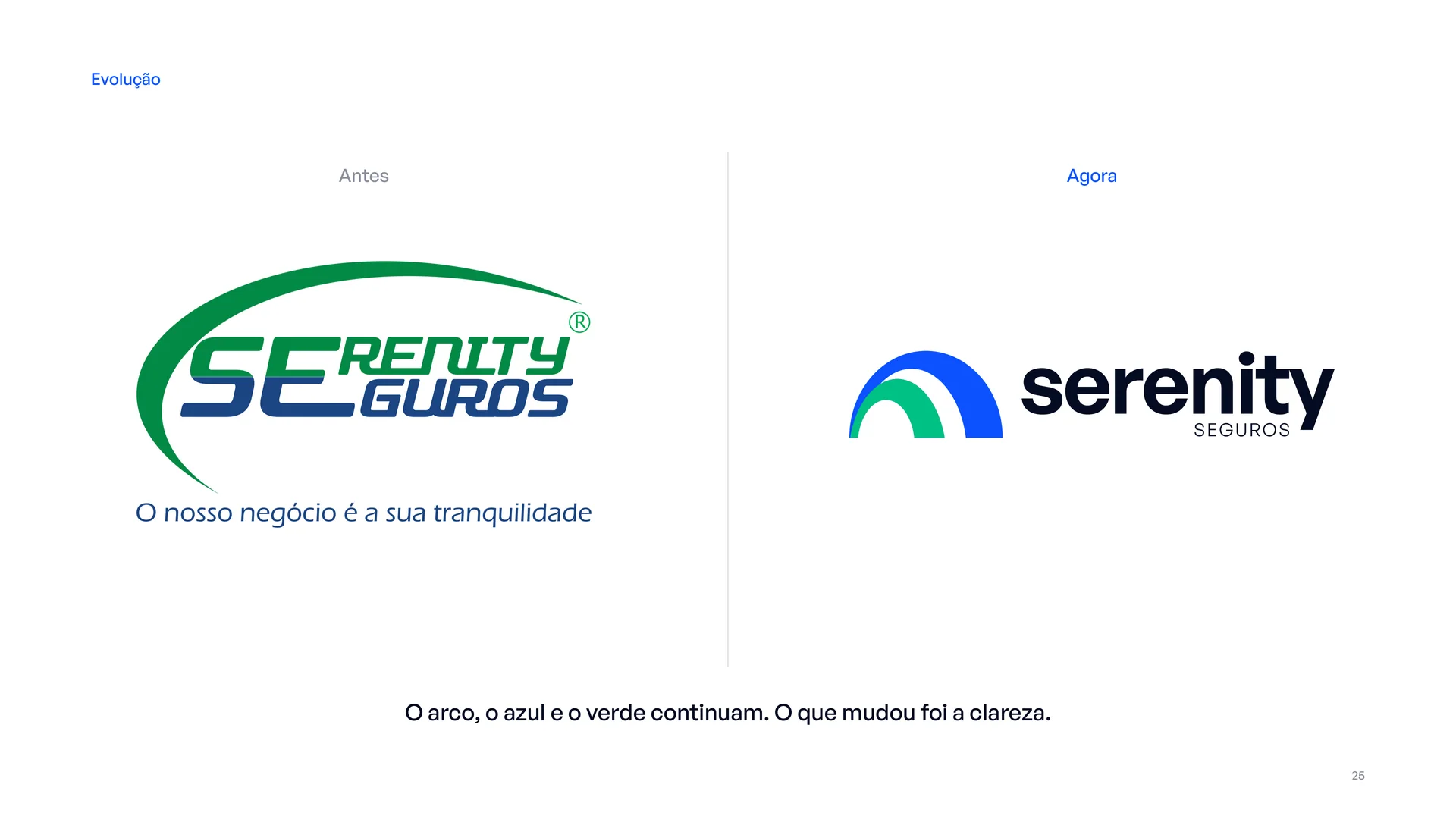
The “SE” ligature got in the way of reading. People read “Renity Seguros”, and even the text layer of the original PDF returned “RENITY / GUROS”. Not even machines could read the name correctly.
The italic lettering suggested haste and movement, the opposite of the solidity you expect from an insurance company.
Green and blue split the weight half and half, with no hierarchy, and in a single colour the logo turned into an illegible blob.
There was no standalone symbol for avatars, favicons, embroidery or merchandise.
What stayed, what evolved
We kept the arch and its meaning of protection, the green and the blue, and the brand promise: “Our business is your peace of mind”.
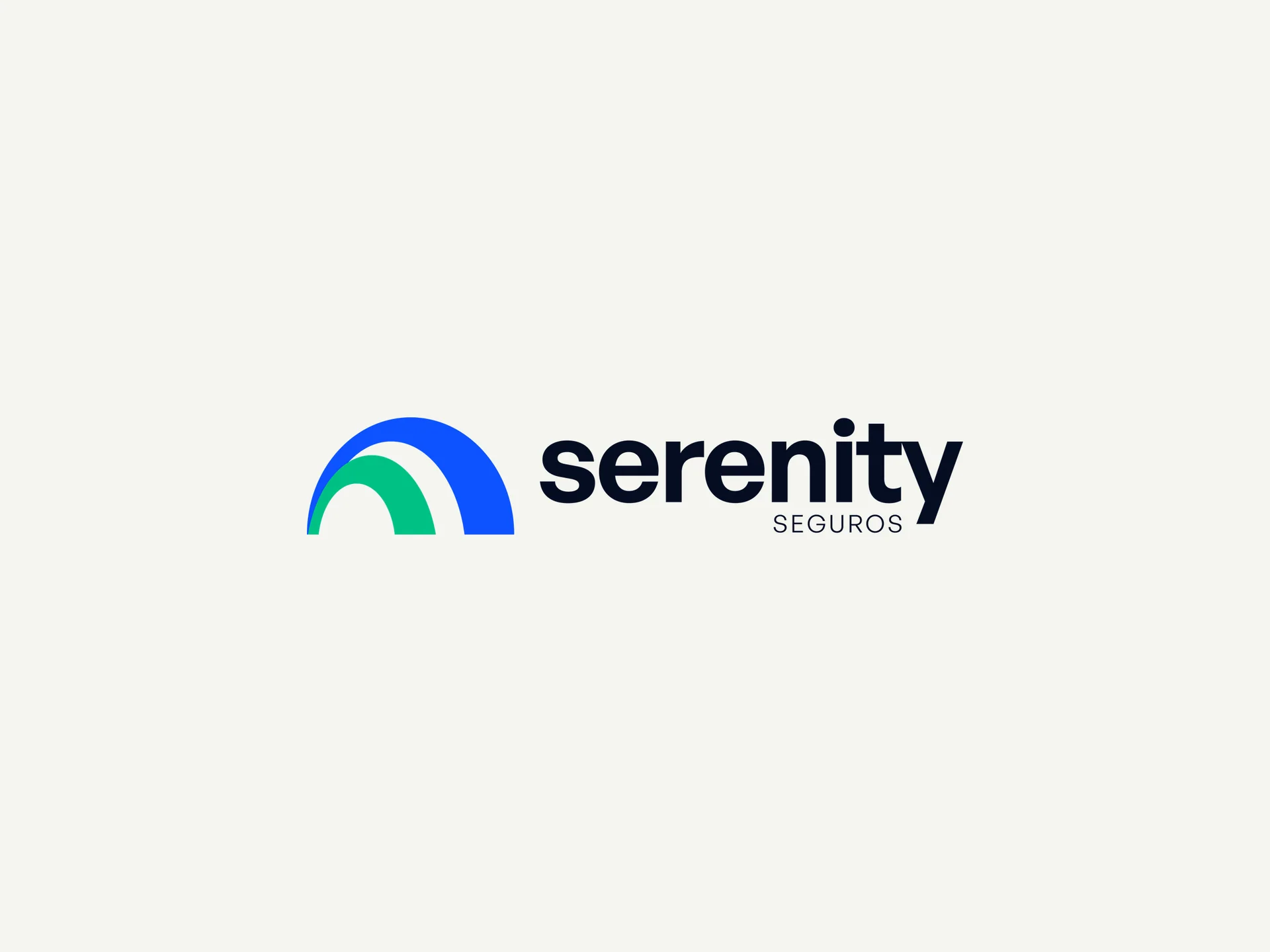
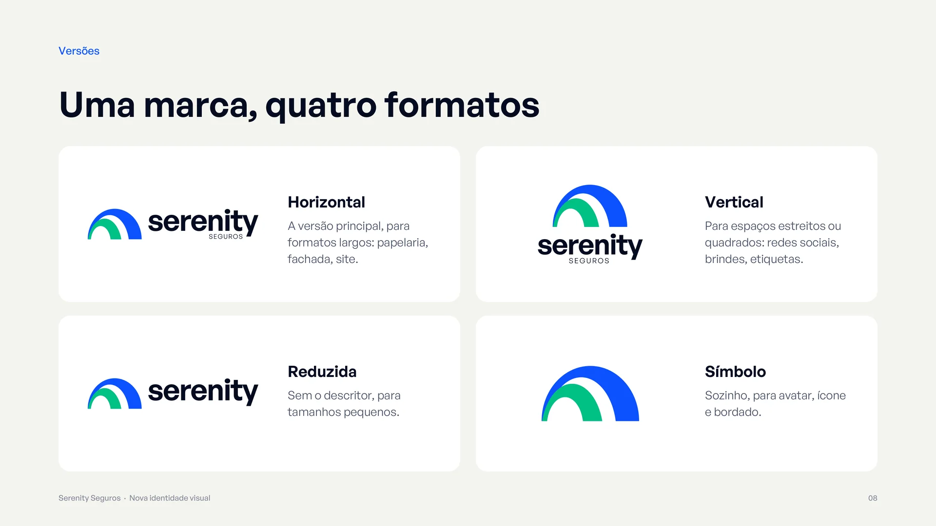
We evolved how the name reads (“serenity” spelled out in lowercase, with “SEGUROS” as a smaller signature), swapped the italic for straight, solid type (General Sans) and turned the arch into a symbol of its own.
Two arches, one promise
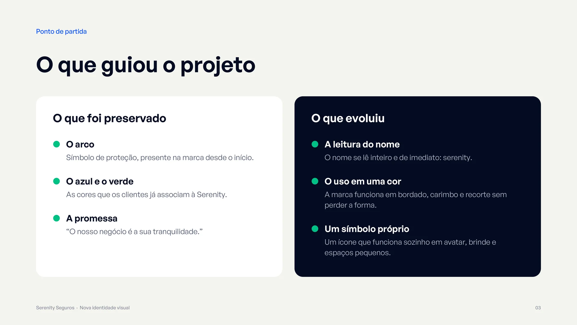
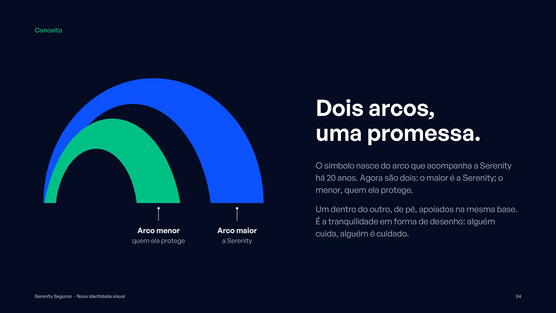
The symbol is born from the arch that has been with Serenity for 20 years. Now there are two: the larger one is Serenity; the smaller one, the people it protects. One inside the other, resting on the same base: someone cares, someone is cared for.
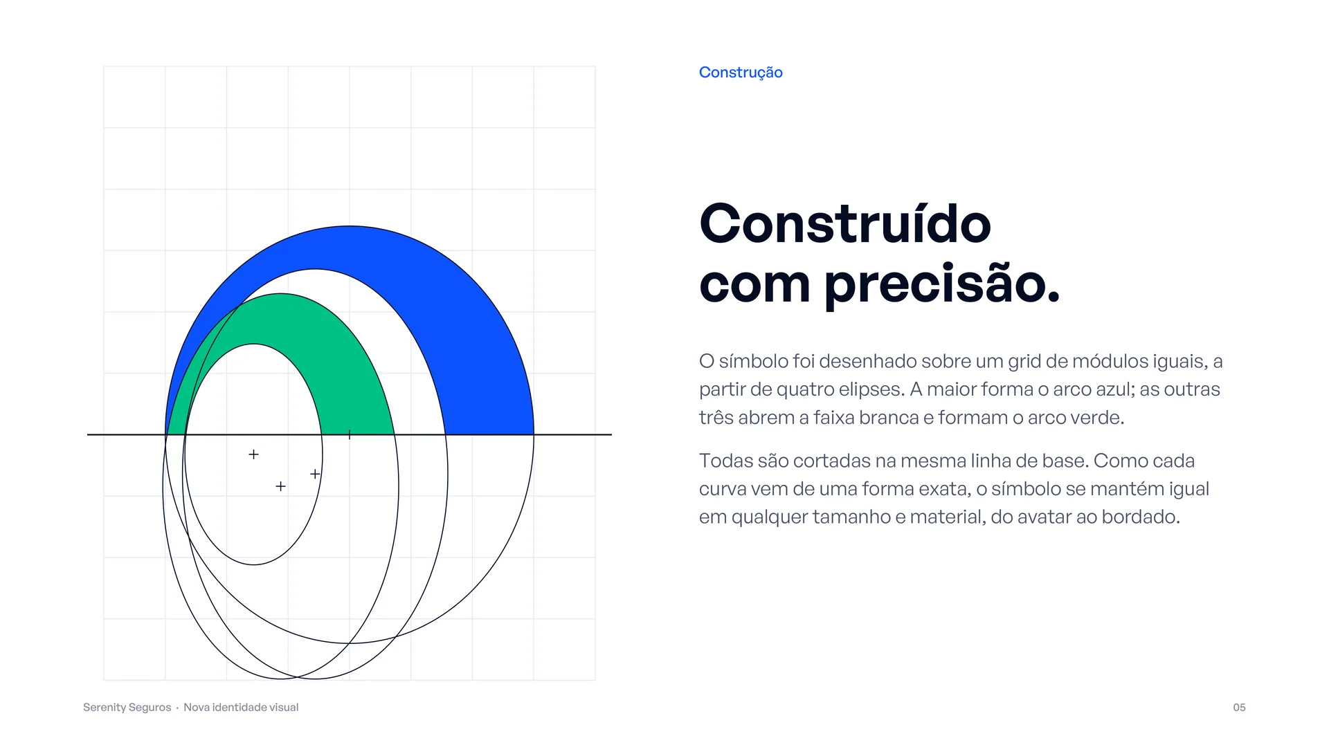
It was built on a grid of equal modules, from four ellipses cut along the same baseline. Because every curve comes from an exact shape, the symbol stays consistent at any size and in any material, from avatar to embroidery.
One brand, many formats
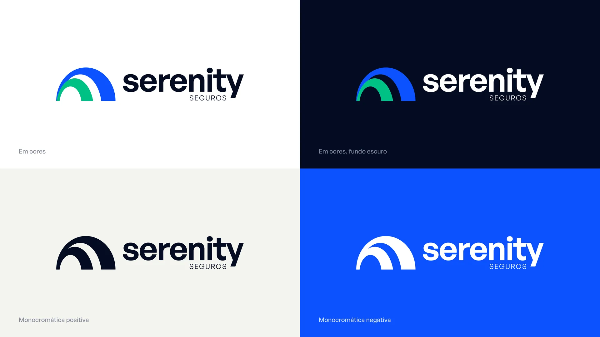
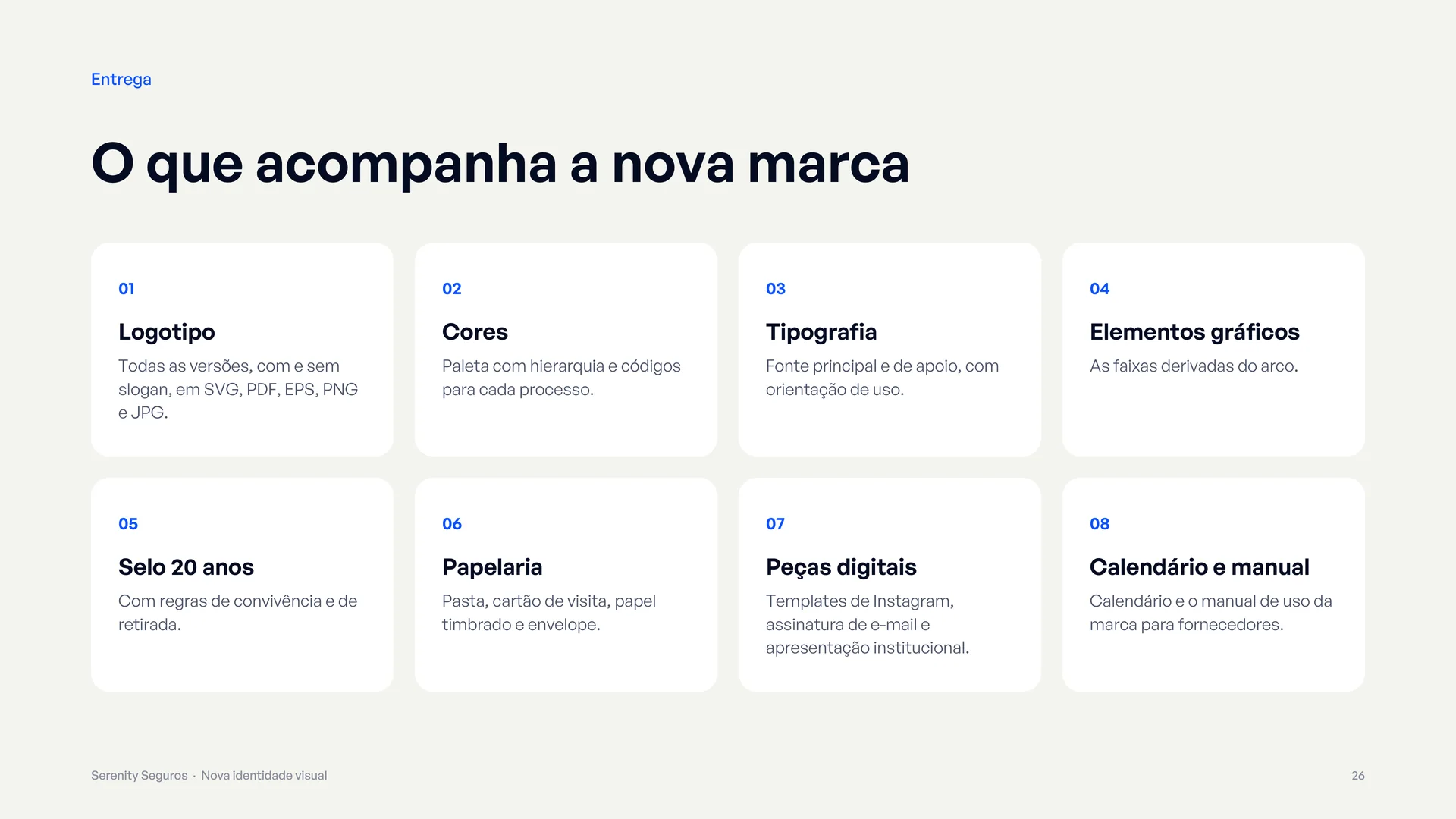
Horizontal (primary), vertical, compact, standalone symbol, with tagline, positive and negative one-colour versions, and an embroidery version with the exact outline, no simplification.
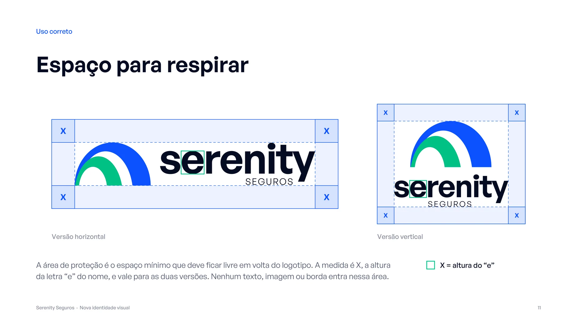
198 files in total, in SVG, PDF, EPS, PNG, transparent PNG and JPG, with clear space already defined.
Colour and typography
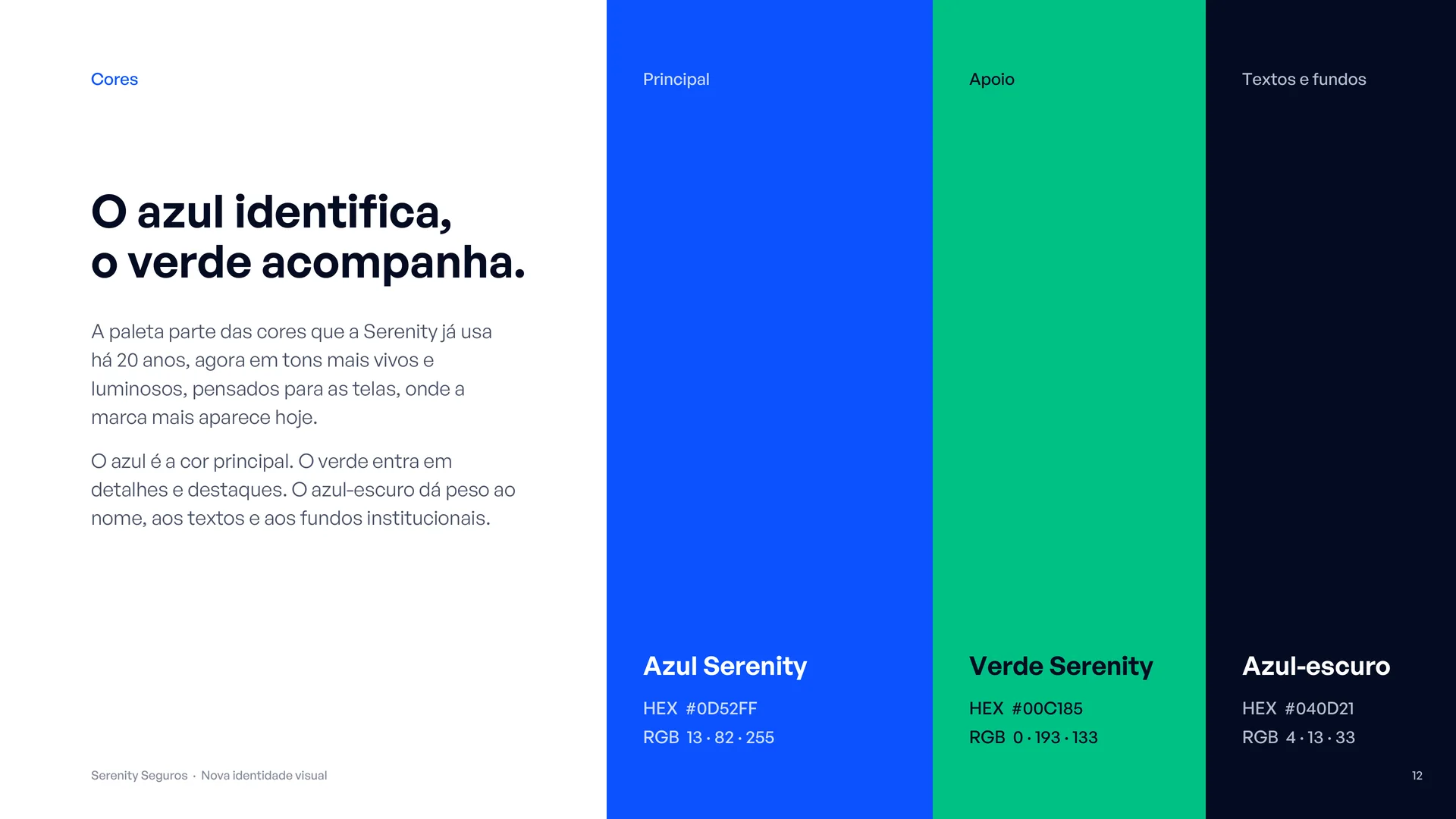
The palette builds on the colours Serenity already used, now brighter and with a clear hierarchy: Blue #0D52FF as the primary colour, Green #00C185 for support and accents, Dark blue #040D21 for backgrounds and text, and Off-white #F5F5F0 as a neutral base, with CMYK values defined for print.
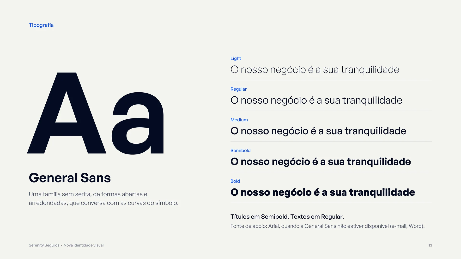
General Sans, a sans serif with open, rounded forms, echoes the curves of the symbol and is used in the logo and across the whole system.
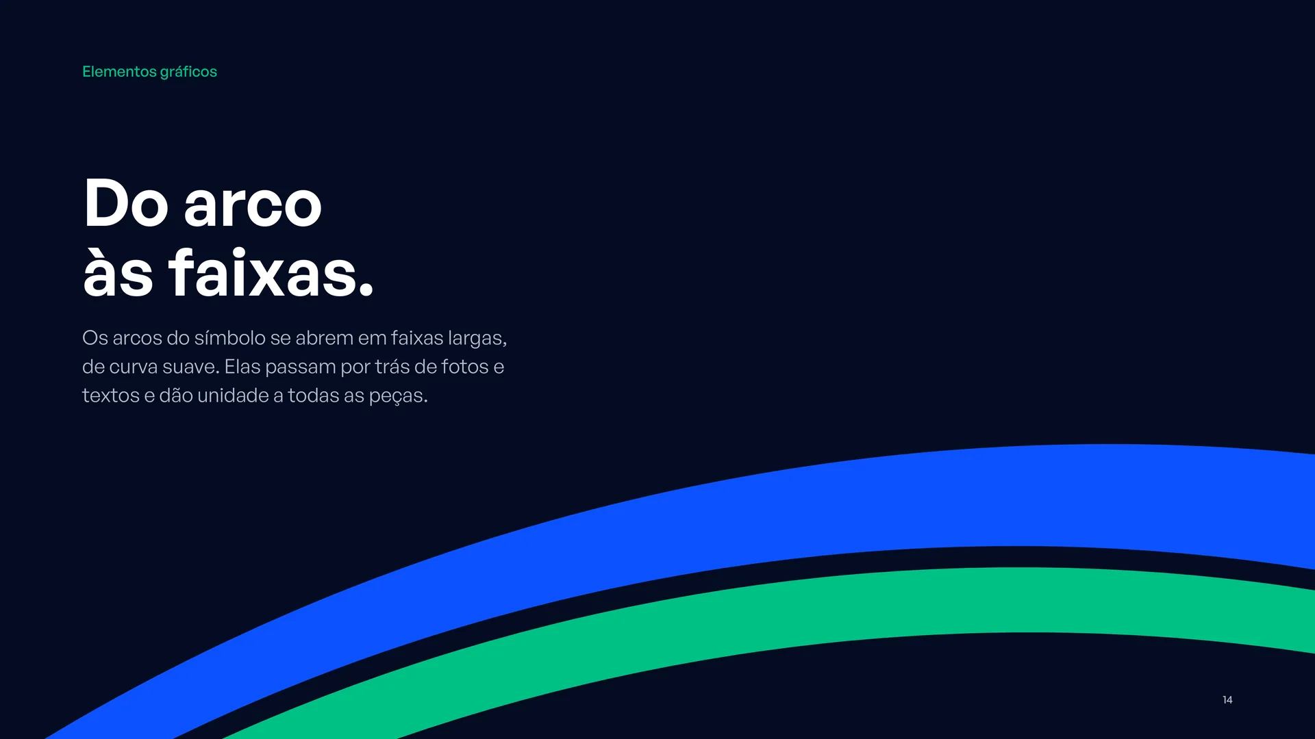
From arch to bands
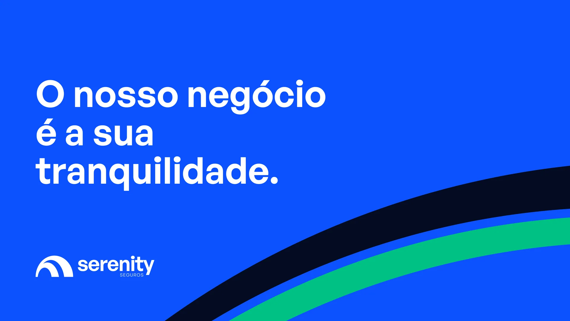
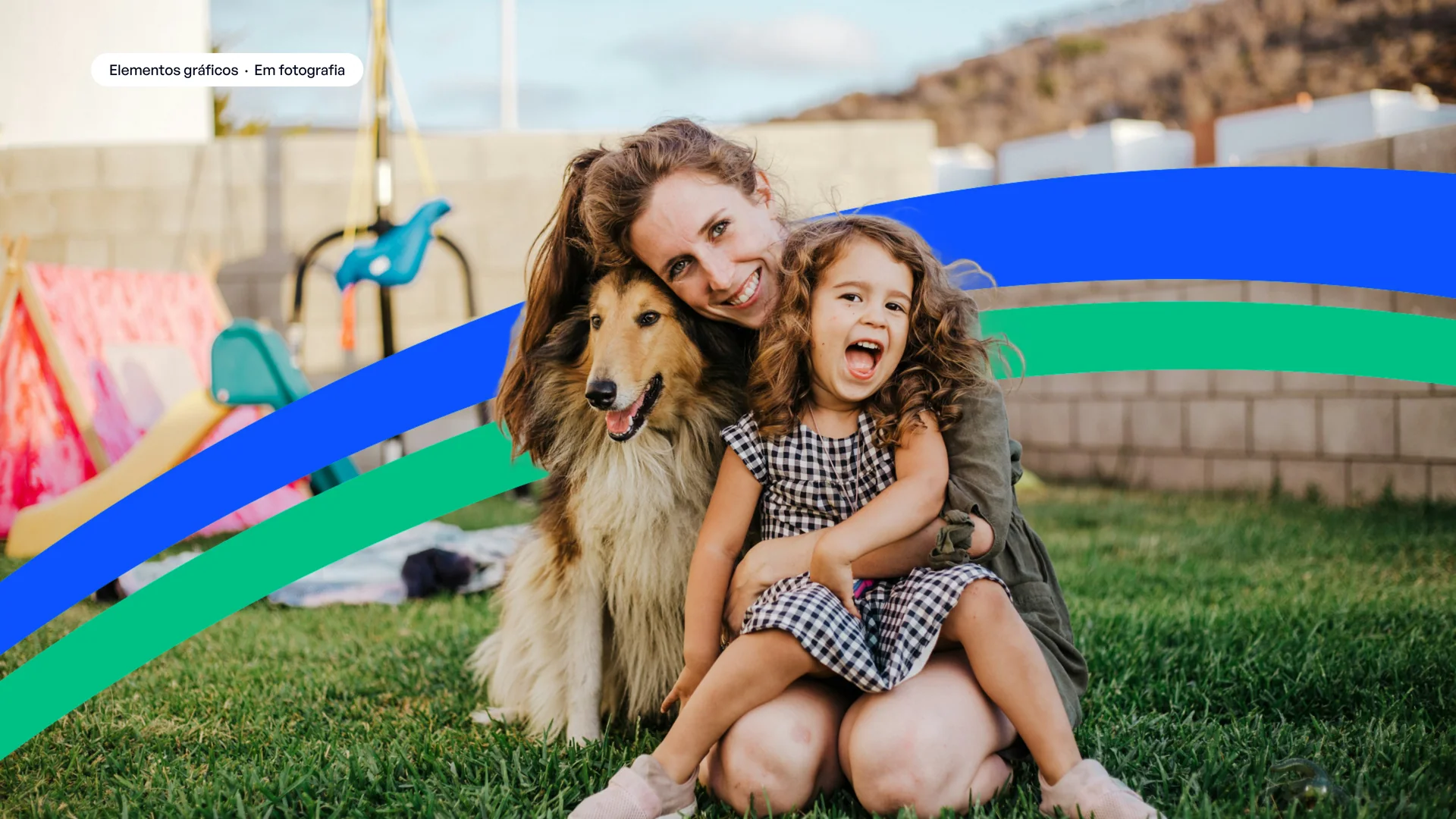
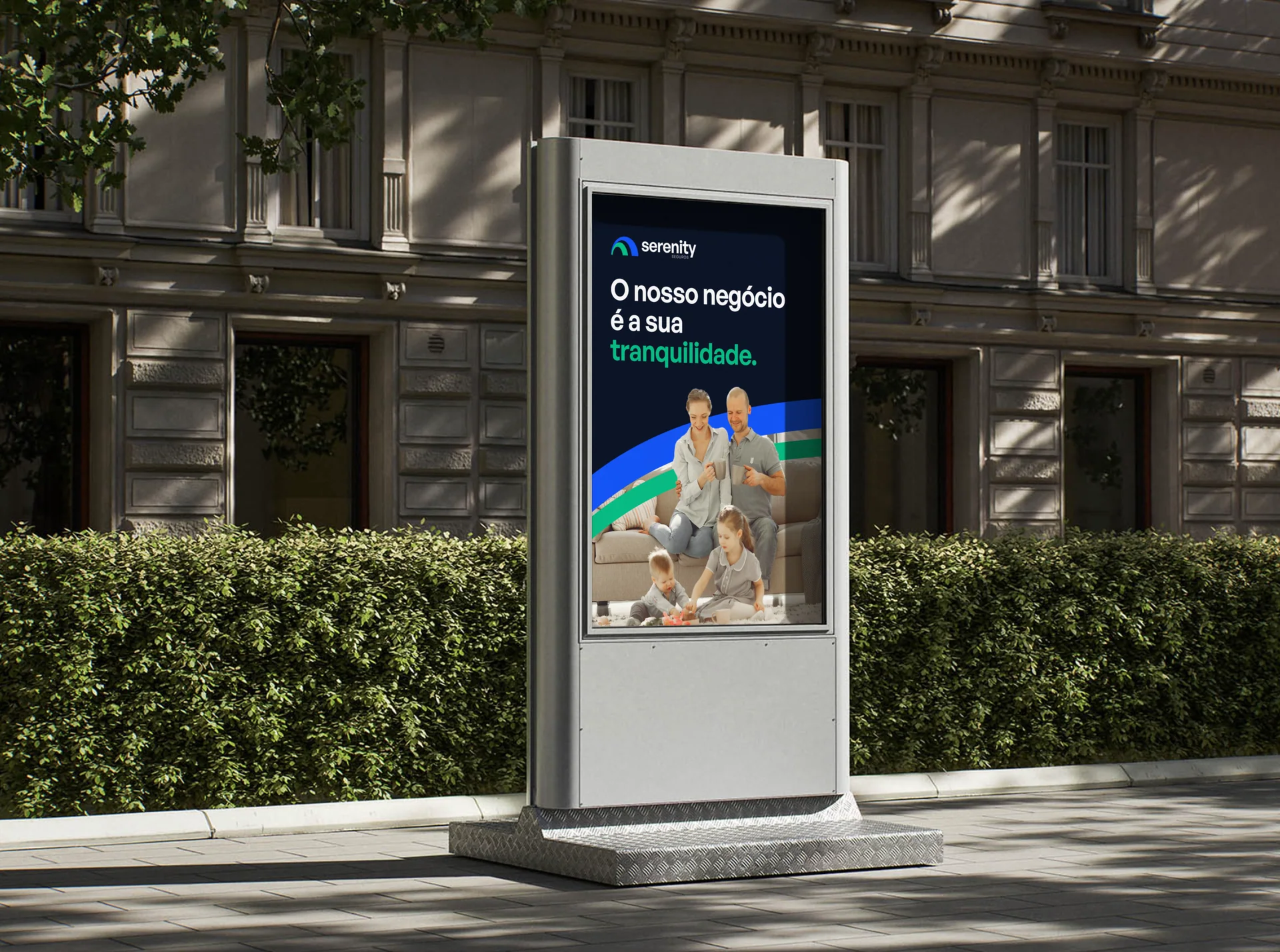
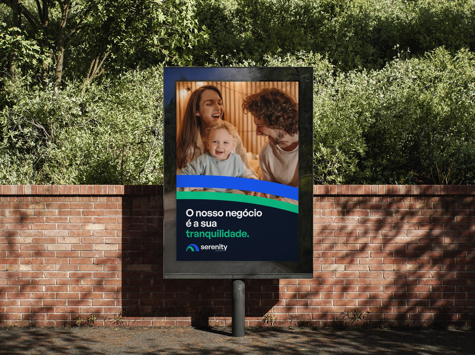
The arches of the symbol open up into wide, gently curved bands. They run behind photos and text and tie every piece together.
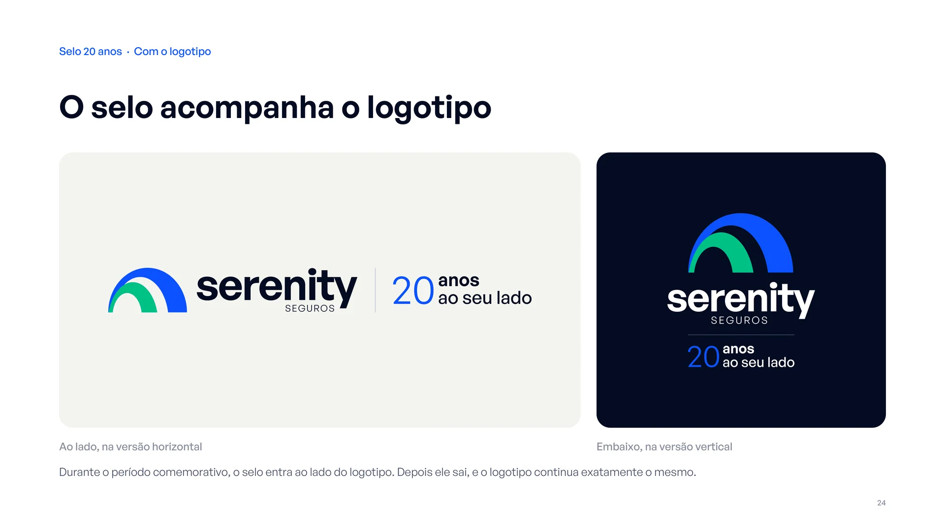
20-year seal
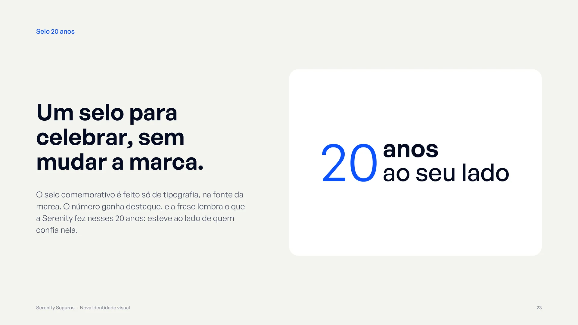
“20 anos · ao seu lado” (20 years · by your side): the “20” in a light weight, with “anos” and “ao seu lado” aligned to the height of the number. The seal works as an independent system, with horizontal and vertical lockups next to the logo and rules for use and removal. When the celebration ends, it comes off and the logo stays exactly the same.
Applications
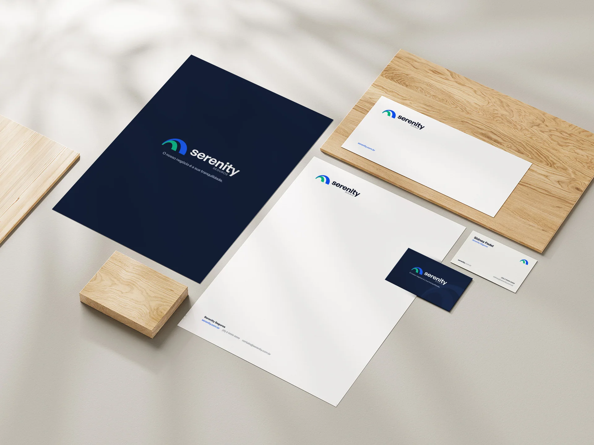
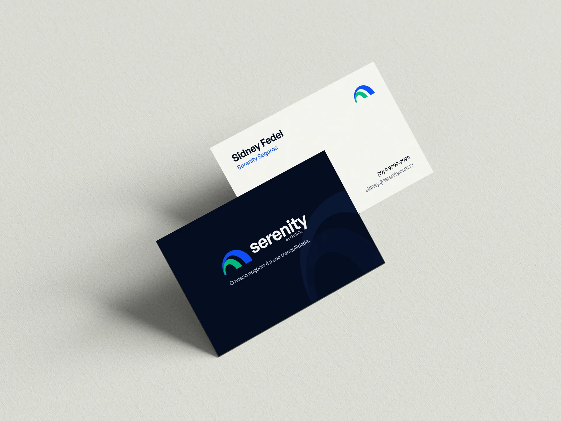
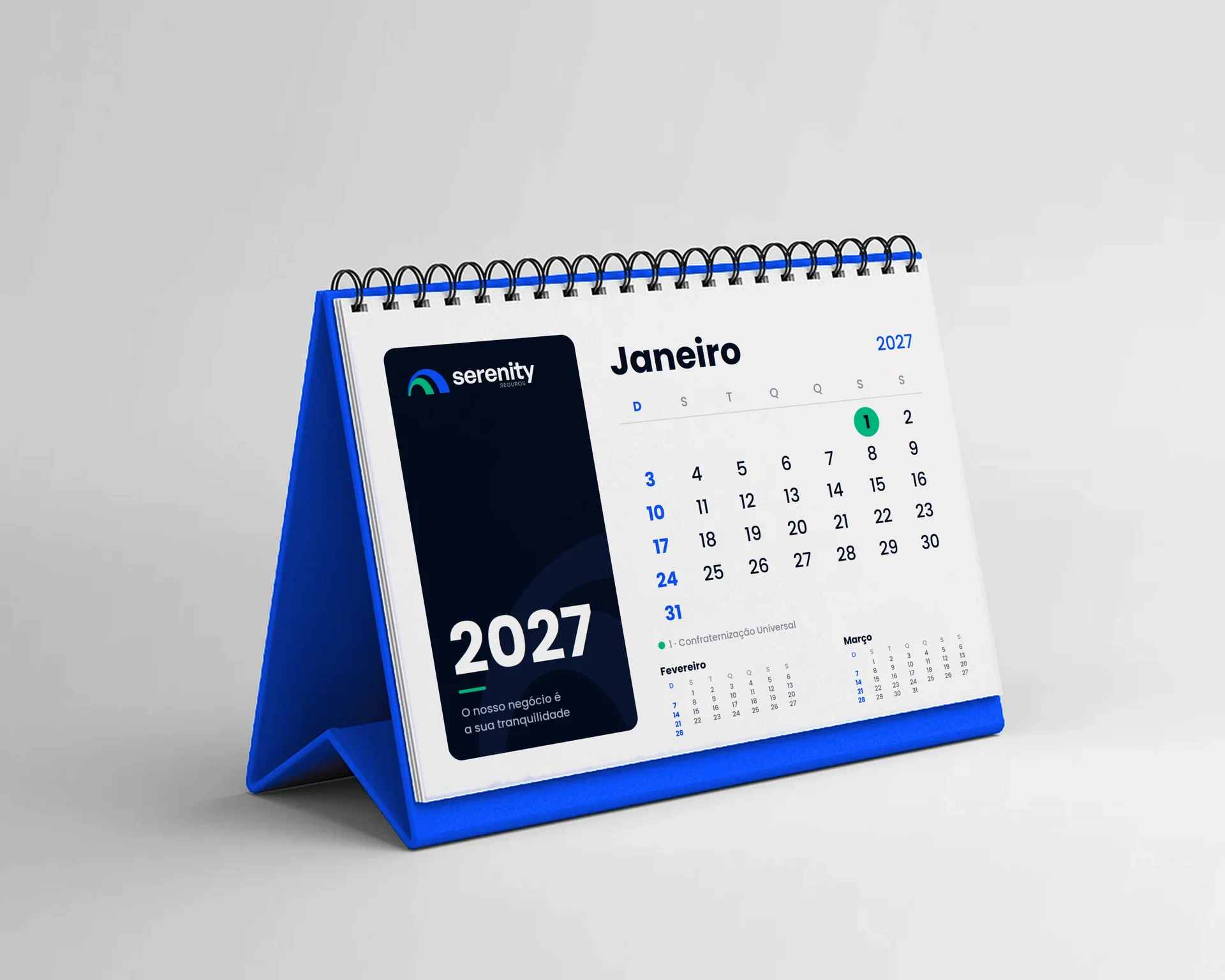
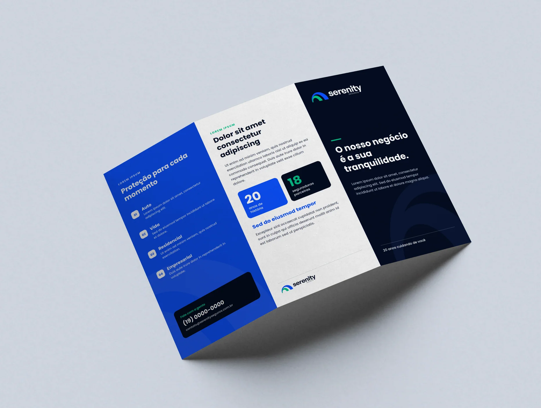
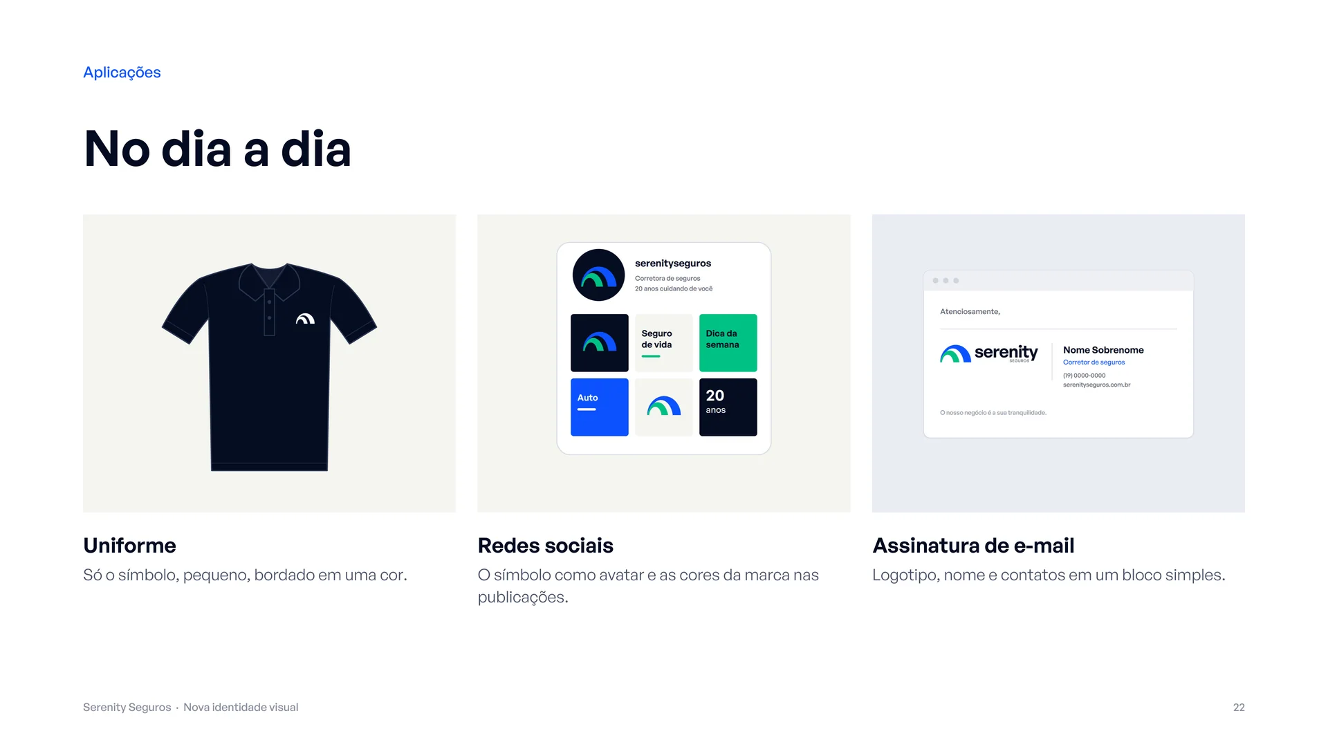
Stationery (business card, letterhead, envelope and folder), a 2027 calendar, a leaflet, a totem, a poster, polo shirts embroidered with the symbol, avatar and Instagram posts, plus an 80 × 200 cm roll-up banner made in partnership with Rede Provectum, print-ready on vinyl.
Deliverables
A final concept presentation (27 pages), from diagnosis to the before/after comparison, and a 49-page brand manual v1.0: construction and grid, clear space, versions, misuse, colour for print and screen, typography, graphic elements, the 20-year seal, applications and a file guide.
“We didn't change Serenity. We fixed what kept it from being read.”